
Our concepts
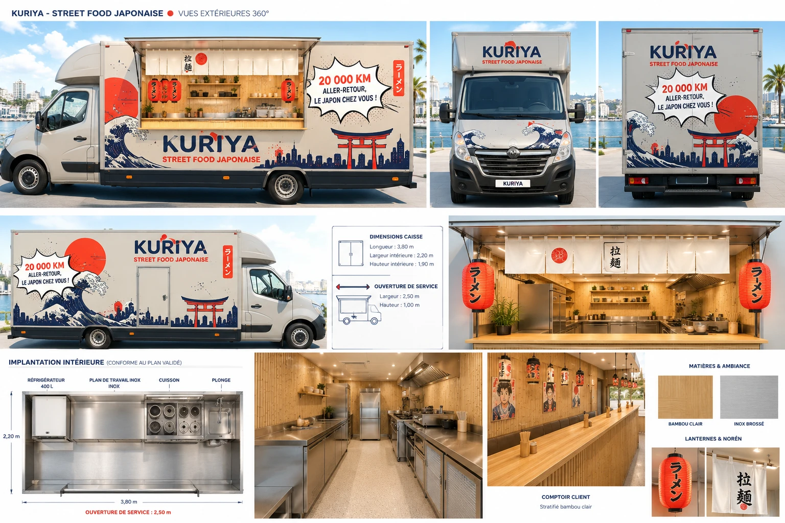
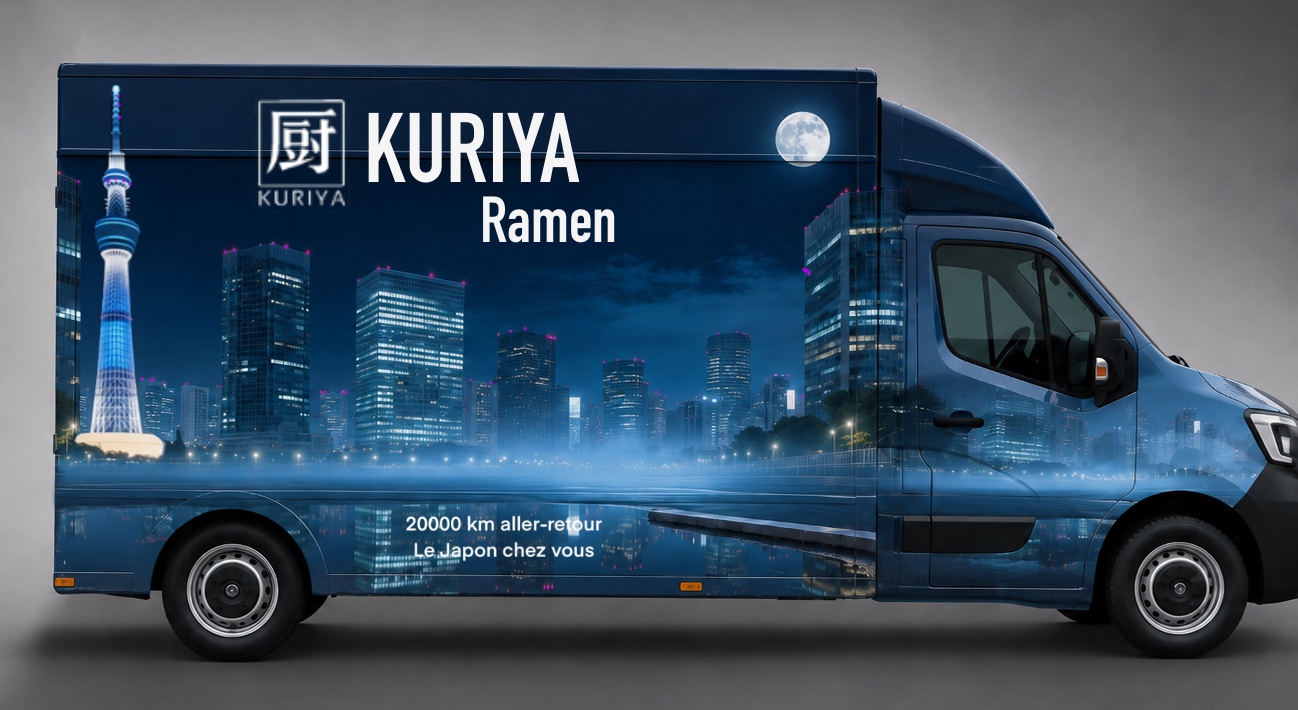
The first two routes, generated by our client with ChatGPT: an illustrative, narrative universe, before MIKA's framing.
The founding vision
Kuriya · chef-driven Japanese street food
Art direction · ramen food truck
MIKA · framing & creative briefs
It all starts with Christophe's vision: Kuriya, a company dedicated to Japanese and Franco-Japanese cuisine, built for offers with strong identity: catering & food truck (structured, field-ready ramen offers), events (the truck as a stage) and culinary consulting.
Four requirements set from the brief: authenticity, experience coherence, production efficiency, profitability.
That's the vision MIKA, the dedicated marketing agent, set out to translate into art direction.
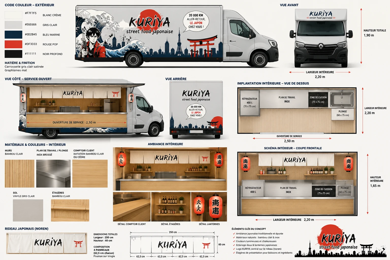
The starting point: V1
The first art direction sets an illustrative, narrative universe:
- the great wave, the torii, a manga hero in the foreground
- a warm palette: cream white, navy blue, pop red
- the promise in a comic-book bubble: "20,000 km round trip, Japan at your door!"
- a validated izakaya interior: 3.80 m box, 2.50 m service opening
The warmth works, the layout is validated, the promise is memorable.
But the livery tells a lot… maybe too much.
V1 board: livery, interior layout and materials
The turning point: why evolve the art direction
Wave, skyline, character, bubble: too many motifs competing on a single face.
Hokusai, torii, manga: symbols already everywhere on the Japanese food-truck market.
At 10 meters, in motion or at night, the name and the offer struggle to stand out.
"Chef-driven street food" calls for a more premium, more controlled language.
Key success factors matrix
- Japanese food trucks (expected codes)
- Generic street food
- Sit-down Japanese restaurants
- Kuriya · final identity
Market map: key success factors matrix (BAM scoping)
MIKA steps in: from vision to briefs
Christophe sets the DNA: Japan, rigor, profitability.
MIKA turns the vision into written creative briefs.
Palette, hierarchy, no-gos: a clean frame.
The studio explores, in situation, day and night.
Convergence toward the truck's final identity.
From vision to visual: every route answers a written brief.
The rules of the game, set by MIKA
"RAMEN" reads first, even in motion.
RAMEN, then its Japanese script, then the baseline.
Reserved for the logo, like a metro line plate.
Micro-touches only, like a Japanese stamp.
70% calm, 20% signage, 10% message.
No neon, no folklore, no clutter.
The briefs' stated goal: "Street Tokyo, but clean and premium: train-car effect, without the neon."
Three waves of briefs, one framed exploration
"Tokyo Wagon / Photo-Spot", "Minimal Premium", "Stage Pro" interior.
The truck becomes a train car: dominant RAL 5003, ivory logo, the 70/20/10 rule.
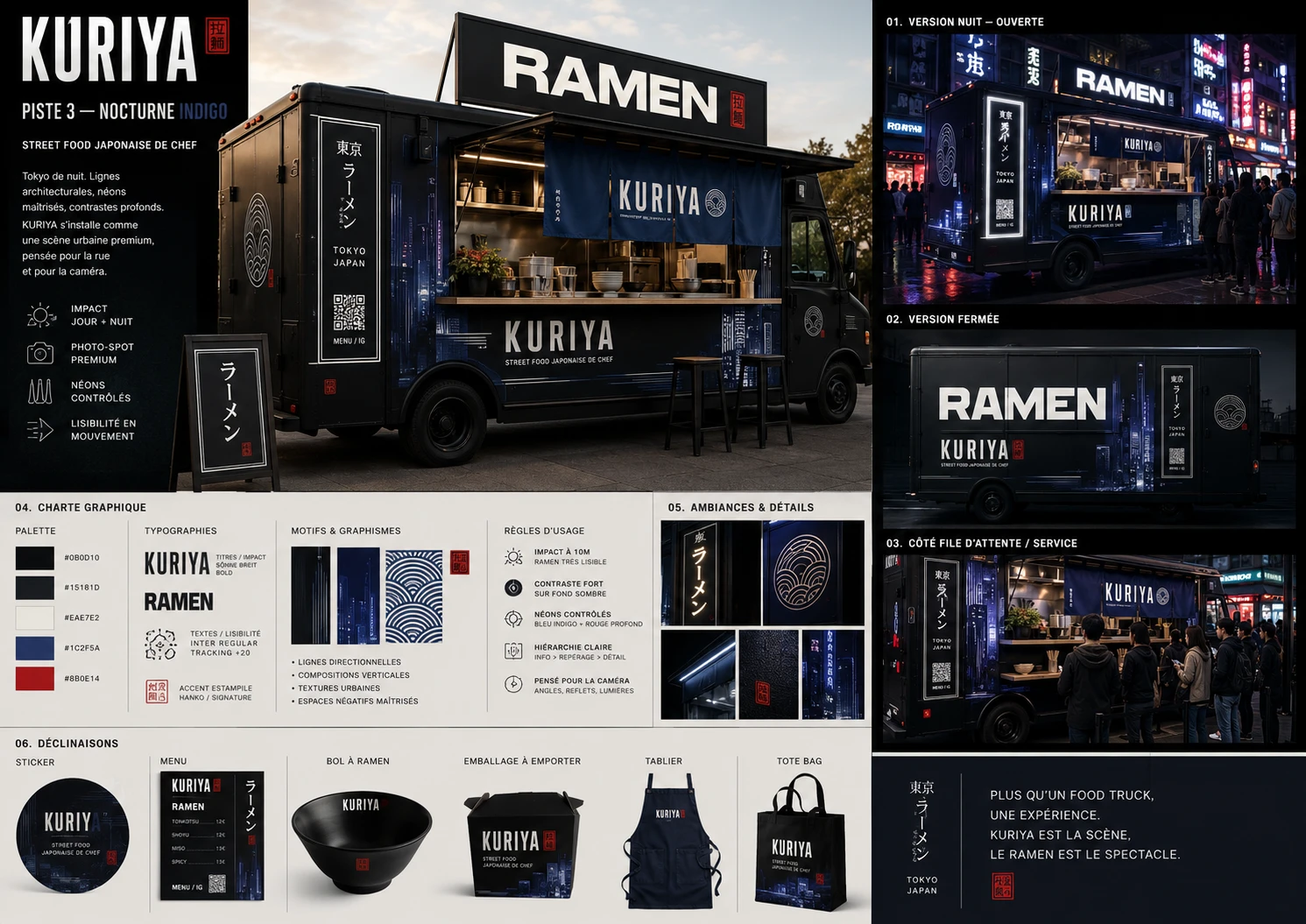
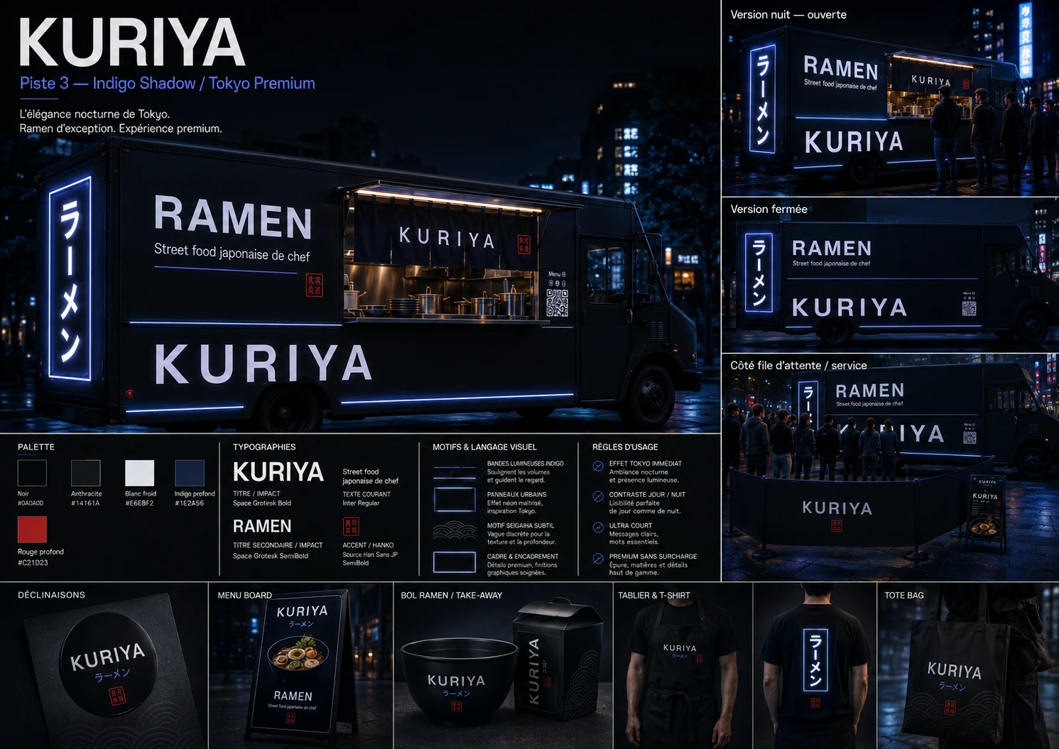
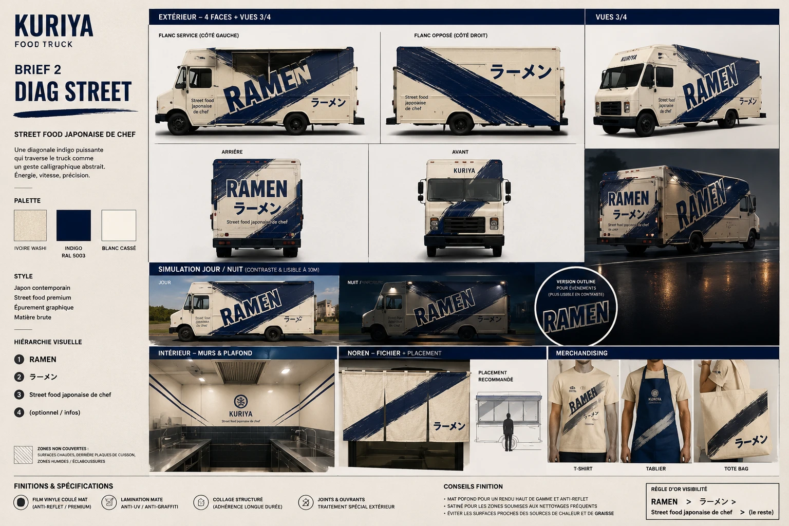
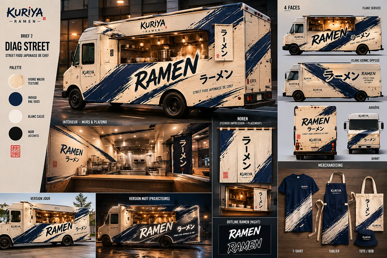
Four concepts on a common base: Noren Bold, Diag Street, Stamp & Grid, Full Indigo Night.
Deliverables required for each brief: 4 faces + 3/4 views · interior & noren · merchandising · day / night mockups · opening templates & finishes.
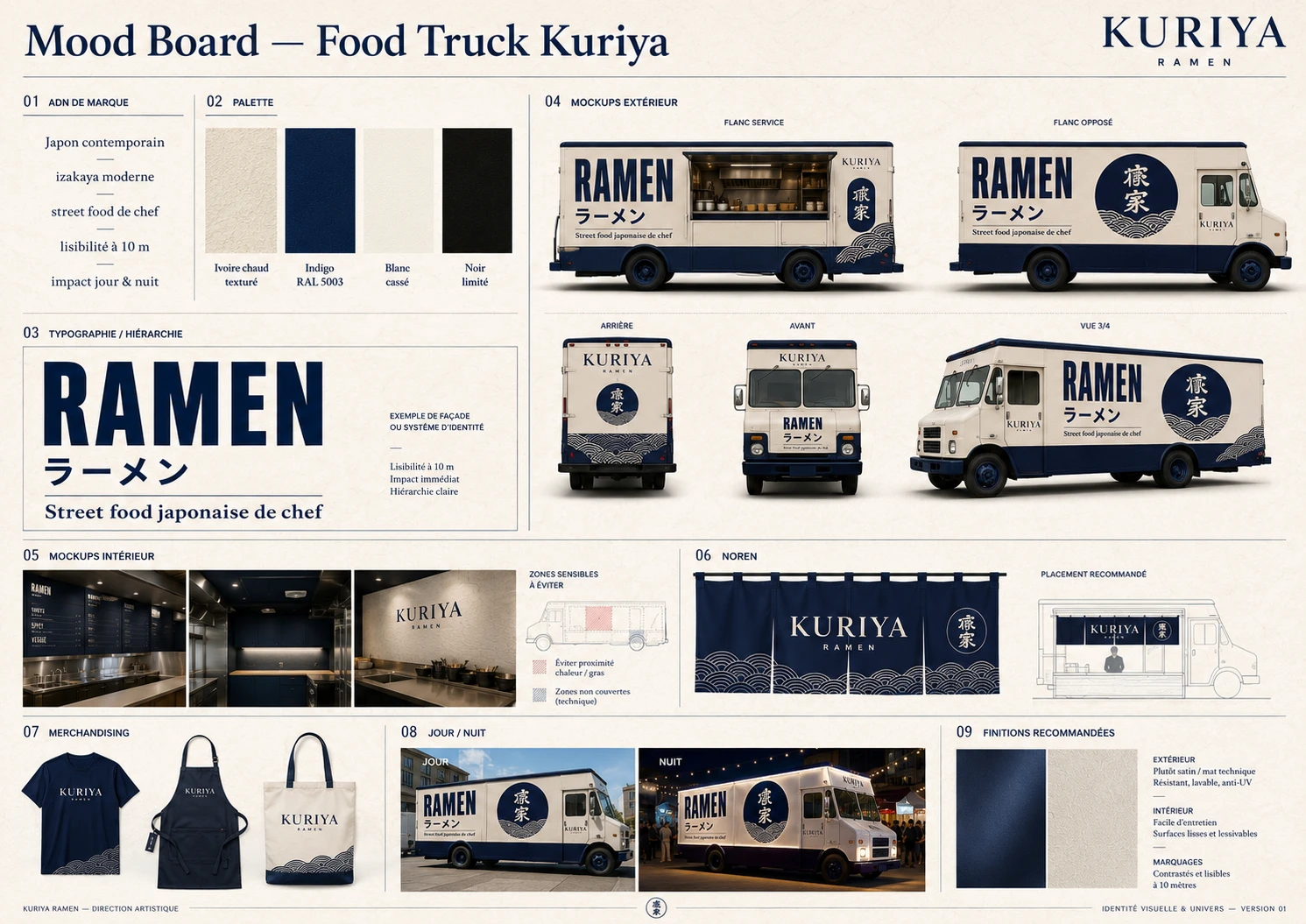
- The founding moodboard: warm washi ivory + RAL 5003 indigo, the seigaiha motif without the folklore
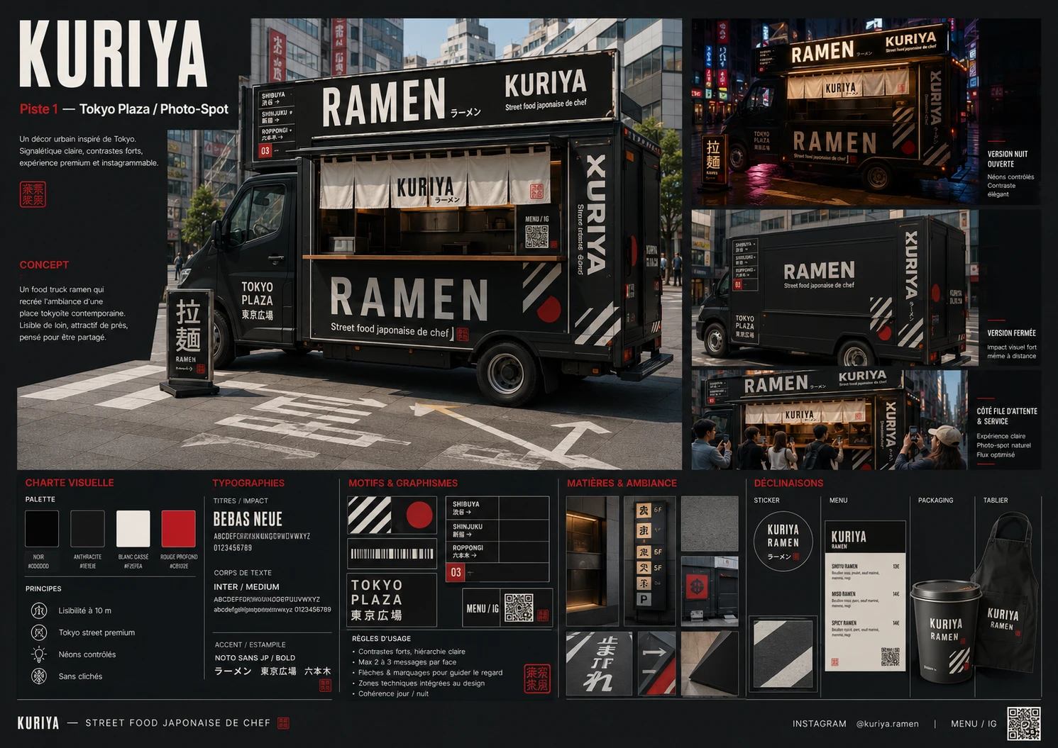
- "Tokyo Plaza / Photo-Spot" route: the truck as a Tokyo station
- "Indigo Nocturne" route: ivory as light on indigo
The boards produced from the briefs framed by MIKA:
The final identity
The synthesis of the routes: an indigo night skyline, a kanji stamp as the signature, and the promise kept, "20,000 km round trip, Japan at your door". Kuriya is the stage, ramen is the show.
- An illustrated scene, a manga hero
- Cream, navy blue, pop red
- Brushed script and comic bubbles
- Hokusai wave, torii, skyline
- Rich, but dense at a distance
- An urban scene, the product as the hero
- Ivory, RAL 5003 indigo, hanko red
- Bebas Neue + Inter, strict hierarchy
- Seigaiha, signage, stamp
- 2-3 messages per face, readable at 10 m
- A full system: menu, packaging, textile
What the new identity brings
Kuriya breaks free from the expected Japanese food-truck codes.
Readable at 10 meters, in motion, day or night.
A natural photo spot that feeds Instagram and word of mouth.
True to Christophe's brief: authenticity, experience, efficiency.
In their words
"BAM does precise, reliable work. The advantage of this agent is the quantity of pointed questions it asks, so you think along with the machine; you're not a spectator of the answer but an actor in it, and I find that essential. We should run every creator's grant application through it: not to discourage them, but on the contrary to encourage them and make them aware of a project's viability by asking the right questions… Excellent tool, and I've only discovered 15% of it."
Christophe B. · founder of Kuriya, on the MIKA method
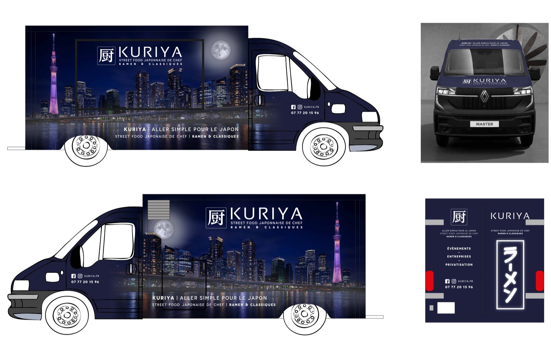
"I just received the latest visual after several rounds of tweaks and I find it pretty cool. BAM found our catch phrase, and the overall mood really speaks to me."
Christophe B. · founder of Kuriya, on receiving the final identity